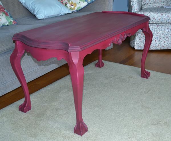
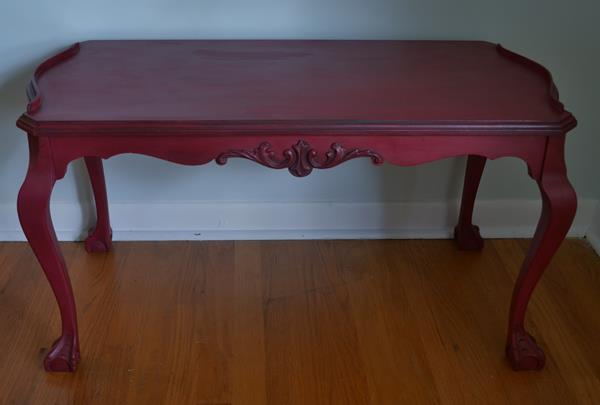
There are a number of reasons why I like using washes on my painted furniture and one of the main ones is that a wash adds dimension and character to the piece. The other reason is that it helps to disguise brush strokes. It’s really difficult to get a smooth finish with chalk paint or latex for that matter, unless you are rolling or spraying it. Sometimes I have painted multiple coats on something that appear to be flawless only to have the brush strokes appear once the top coat, whether it’s wax or poly, is put on. Annie Sloan’s paint is not designed to conceal the brush strokes as it is all part of the antique-painted look but I am not always happy with how the surface looks. That’s where a wash, glaze, dry brush or dark wax treatment comes in handy and a thin chalk paint wash is my method of choice.
Applying a wash is not always easy but this is what I have found to be most effective: Apply two coats of the base colour. Water down the wash colour so that it is quite thin and apply to a dry surface. Let it dry completely then go over it with a damp cloth to soften the wash. Use a dry cloth which you fold over a lot to wipe off as much of the wash as you want. The trick is not to press too hard and to repeat the steps until you get the look you want. If you get it too wet, you will remove the base coat, that’s why I prefer to let my wash dry before I start the removal because I have found that if I try to do it when it is still damp then the base colour may come off.
Washes are very good for wood surfaces that are not very smooth or for highlighting carved details. This dresser was originally white and had many coats of old paint on it. Even after I sanded it, I found that I could not get a completely smooth surface to paint. I knew that a wash would settle into some of the rough areas and really improve the look.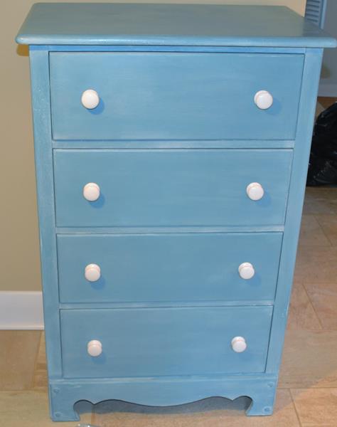
The colour is a mix of Old White and Napoleonic Blue. It is a beautiful shade and with the white wash it looks like faded denim. It would have looked fine just blue but the wash adds a special dimension to it.
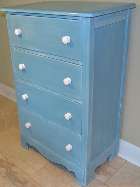

The photos aren’t quite close enough but the wash settled into the pits and brush strokes on the surface. Some of the original white paint is also peeking through in the areas where I may have rubbed off too much.
http://elizabethandco.blogspot.ca/
http://ivyandelephants.blogspot.ca/2014/10/shoe-in.html?utm_source=Friends+of+Ivy+%26+Elephants&utm_campaign=7c89c5bfe1-Shoe+In&utm_medium=email&utm_term=0_a51593f650-7c89c5bfe1-94275393
http://thestylesisters.blogspot.ca/
http://sweethaute.blogspot.ca/
http://ithappensinablink.com/2014/10/5-pumpkin-recipes.html
http://www.redouxinteriors.com/2014/10/redouxinteriors-and-the-handmade-hangout-week-21/
http://missmustardseed.com/2014/10/furniture-feature-friday-favorites-link-party-44/
http://www.lifeonlakeshoredrive.com/
http://www.findingsilverpennies.com/2014/11/silver-pennies-sundays-link-party-features-93.html
http://www.thehankfulhouse.com/2014/11/get-your-diy-on-furniture-revivals.html