Projects from 2016

This past year has been one of great creative growth for me.  I still painted a lot of furniture but discovered a new love indirectly through painting.  Last summer I was inspired by Annie Sloan’s Inspiration page to try shibori dyeing with chalk paint.  My efforts with chalk paint were attractive but I really wanted to see what using indigo and Procion MX dye would be like.  I haven’t looked back and have been very busy experimenting with different types of shibori for pillows, tea towels and scarves.  I used to sew many years ago and have now re-learned some of those skills as well.

Here are some of my favourite pillows and painted pieces from 2016:

black-and-white-pillow-3

green-and-white-pillow

shibori-silk-1

jeans2

tribal3mcmdesk1A

kid's 7

kates-dresserdressing-2

Have a creative 2017, everyone.

http://www.findingsilverpennies.com/2017/01/silver-pennies-sundays-link-party-199.html

Decoupage to the Rescue

Three years ago, I wrote a post about waterfall furniture.  It certainly is not my favourite style of vintage furniture and I usually avoid painting it.  My blog post, however, is very popular ( 20,000 views) so I am guessing that there are a lot of people who want to know about its value or history.  You can read it here if you are interested.   This waterfall vanity was given to me by a friend who had bought it rather cheaply, so I  painted it.

waterfall vanity

The veneer on the top was not in great shape.  At first, I tried to patch it but there was just too much peeling so I removed all the veneer in the middle section.  The other top sections looked ok but had thin cracks where the wood had dried out.  Unfortunately, I decided to paint those sections as is, which was a mistake.  The paint made the cracks more noticeable.  I had originally wanted to stencil across the top of this table but I decided that might not be the best course.  S0, rather than start all over, I chose to conceal the cracks with decoupaged napkins.  I had a package of birds and flowers that had a white background which seemed suitable for the feminine look I was going for.

dressing5

I used Mod Podge to apply the pieces then I sealed the top with 3 coats of acrylic varnish.  The table and the matching chair are painted in Annie Sloan Pure White chalk paint mixed with a bit of grey to give it some pigment.  Pure white is a devil to work with so I try to add something to it.  Old White is good addition but I wanted a cooler tone.  I even painted the seat  of the chair  which was covered in brown vinyl.

dressing 2

There was some nice detail on the front of the vanity so I painted it a pale pink to match the roses in the paper and added gold gilding paste on top of that.  I also painted the insides of the drawers in pink.

dressing3

This vanity has a matching mirror but I am not fond of the frameless look which was typical of the era.

dressing 7

The overall effect is totally feminine but why not?  It is a dressing table after all.

dressing 1

dressing 6

Waterfalls are still not my style but this did turn out very well.


Linking up with:

http://piecedpastimes.blogspot.ca/

http://www.findingsilverpennies.com/2016/08/silver-pennies-sundays-link-party-182.html


Tribal/Boho Style

Boho(bohemian) style is a mixture of colour, pattern and furniture eras.  It is bold, eclectic and vintage looking.  Tribal style, on the other hand, uses earth tones and is inspired by native cultures, using their patterns and artifacts in decor items.  Both styles are popular today and both have connections to the 1960’s and earlier eras.

I wanted to try stenciling paint on stained wood and this little table seemed like the perfect project.  It is oak, probably from the 1970’s and it had a glossy poly finish.  I stripped the top and stained it with dark walnut to make it a bit darker.  Then I applied a large wall stencil with white chalk paint.

tribal6

One of the nice things about large stencils is that they give you the repeat pattern outline on all 4 sides so that it is easy to match up the pattern accurately.  I used a stencil brush and was careful to off-load most of the paint.  Taping down the stencil and off-loading are the key to getting clean lines.

tribal2

I painted the base in matte black and added some white paint to the small handle so that it mimics the stencil.  I like the look of black with dark wood and this seems an appropriate combination for the mid-century lines of the table and the tribal look.

tribal3

Strictly speaking,  I wouldn’t say that the stencil is a tribal pattern but it resembles one.

tribal5

tribal4

tribal1

I see it as a boho/tribal look because of the mix of colours and styles.


Linking up with:

Home

http://www.domesticcharm.com/creative-circle-link-party-6-14/

http://piecedpastimes.blogspot.ca/

Retro meets Glam

Furniture produced after the Second World War shows a definite shift from darker heavier woods and colours to those that are light, less bulky and even whimsical.  Heywood Wakefield is credited with bringing this shift in American tastes by introducing a line of blonde furniture that became very popular in the 1950’s.  There is a definite revival of interest in this furniture because it is retro looking and it is very well-made.  You can read about this revival here.

Blonde furniture was usually birch or maple with a golden or pale stain.  The set that I bought is blonde mahogany which was achieved by bleaching the wood before staining it.  It is made by Gibbard, a well-known manufacturer of fine furniture in Canada.  It came with a frameless mirror but that look is too dated for most people.

gibbard desk 1gibbard nighstand

It is mahogany veneer over solid wood.  The original owner had kept a glass top on both pieces and they were in near perfect condition.  The brass knobs are distinctive and original.

I refinished the tops and painted the bodies in Pure White with a bit of French Linen mixed in.  It is still white but has a grey tone.  Pure White has no pigment and needs many coats; by adding some colour to it, you get a lot better coverage.  Because the wood had been bleached originally, it would not take a dark stain so I opted for a chestnut colour which was close to the original but richer in tone.

mcmdesk1A

mcmdesk3

I cleaned the beautiful brass knobs then added some gilding paste to make them brighter.  It makes a great desk or could still be used as a dressing table in a bedroom.

mcmdesk2A

mcmnight stand6

mcmdesk5

mcmdesk top 7

mcmdesk6

mcmdesk4

It definitely has a glam look to it.


Linking up with:

http://www.findingsilverpennies.com/2016/07/silver-pennies-sundays-link-party-176.html

http://www.sadieseasongoods.com/talk-town-27/

The Creative Circle Week 73

http://www.mccallmanor.com/link-party/your-inspired-design-43/

http://piecedpastimes.blogspot.ca/


Using Hemp Oil on Chalk Paint

grey and gold1

I decided to try MMS Hemp Oil as a finish on a chalk painted dresser.  I have used the oil on wood that needed reviving such as inside drawers but I have never actually put it over paint.  Hemp oil is an all natural product that has no VOCs and has a mild, nutty odour.  Read Miss Mustard Seed’s explanation about the oil here.  Having used oils such as Tung, Danish and wipe-on poly on wood that I re-finished, I knew that Hemp oil would be easy to apply  but I wasn’t sure about durability.  This, after all, is a food-grade oil.  Apparently, it sinks into a porous surface like milk or chalk paint and binds the paint.  That’s essentially what wax was does to chalk paint and like wax, hemp oil has a 30 day cure period.  You can add an extra coat of hemp oil to the surface if you want more protection or you can put on a coat of wax.

So, what are the pluses to using it?  Number 1 has to be the ease of use.  You rub it in with a cloth or a natural bristle brush and wipe off the excess.  That’s it.  The second bonus is the the appearance-it leaves a flat even surface.  Anyone who has used wax knows the frustration of uneven waxing.  I’m pretty sure that waxing is the number 1 topic of discussion among chalk painters. Finally, if you are at all sensitive to solvents like those in wax, then you won’t be breathing in chemicals with Hemp oil.   The downsides?  Well, it doesn’t feel as nice as wax since wax gives a slippery touch to a piece.  It also feels a bit oily until it cures.

Neither wax nor hemp oil are totally water-resistant, so in that regard they are similar.  I painted this small dresser in AS French Linen with a bit of pure white and some gilding paste.  I love the way the Hemp oil looks on the piece.  After 24 hours, it didn’t mark when I put something on the top and the paint did not rub off anywhere when I tried to scratch it.

grey and gold2

grey and gold 3grey and gold4grey and gold 5

If you want to read more about Hemp oil, here is a link to Homestead  House paints who manufacture it.  They explain how natural oils like Tung and Hemp work.


Linking up with:

Home

http://linda-coastalcharm.blogspot.ca/2016/06/show-and-share-no317.html

http://www.sadieseasongoods.com/talk-town/

http://www.bluewillowhouse.com/2016/04/14/vintage-charm-26/

http://www.mccallmanor.com/

The Creative Circle week 70

http://www.thepainteddrawer.com/2016/06/painted-drawer-link-party-58.html

http://piecedpastimes.blogspot.ca/


A Whimsical Dresser

zig zag3
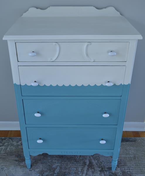
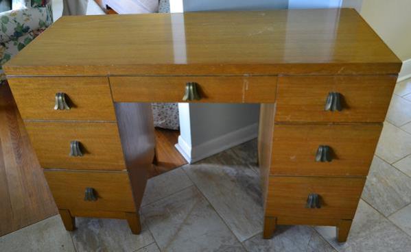
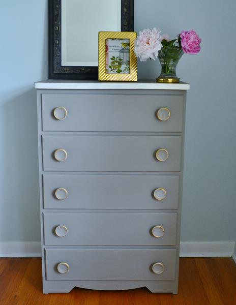
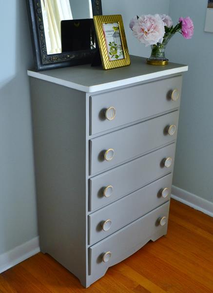
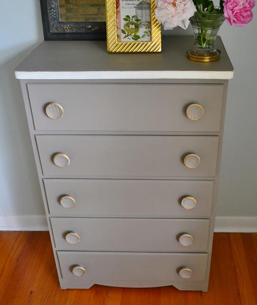
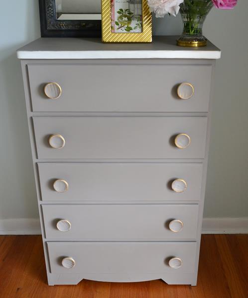
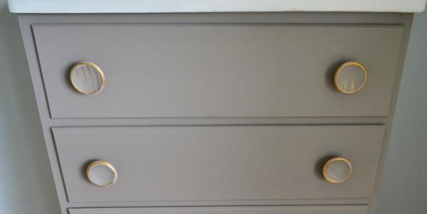
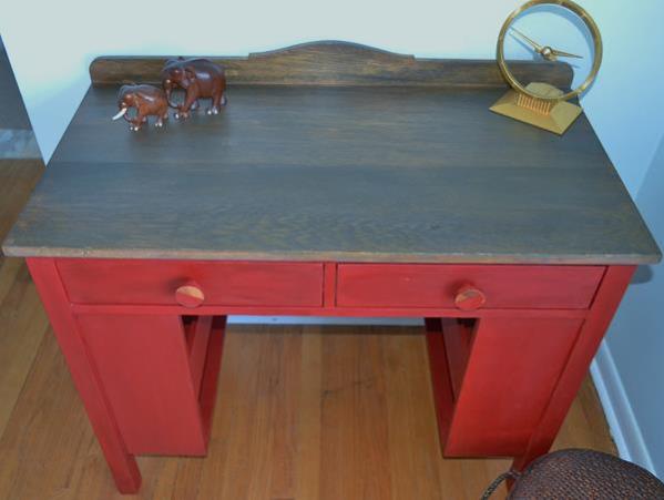
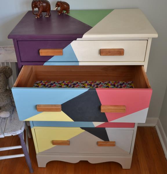
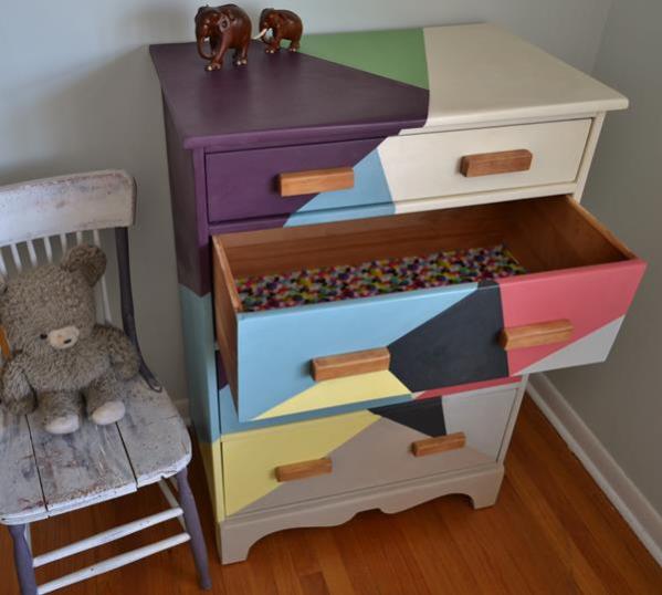
I bought this vintage maple dresser knowing that I wanted to try something like this zig-zag pattern on it. The dresser is probably about 50 years old, solid maple, even the drawers, and not very big. Its size makes it perfect for a child’s room. I have seen dressers painted like this online and wanted to give it a try.

Creating a pattern is really trial and error.  I used chalk to draw the lines and then began taping.  There are some very reliable methods of creating a clean line when using tape: you can see one of them here.  This video uses painter’s caulk; another method is to use tape and paint the base coat over the tape then the new colour.  Both methods work but I couldn’t figure out how to do them with so many lines and different colours.  So, I taped then painted one colour, waited for it to dry, then did a different colour.  This method requires that you remove the tape, wax ( so that the new paint won’t peel off ) and re-tape for the new colour.  Time-consuming and not fool-proof-I had to do a lot of touch-ups where the paint bled under the tape.

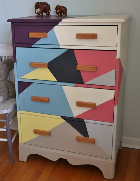
Orignally, I painted the pattern in a colour-block pattern:zig zag6

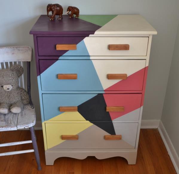
But, I realized that the middle 2 drawers were the same size, so after I painted them, I decided to see what they looked like when they were switched.  The effect is more of a zig-zag pattern and I prefer it.zigzag 2

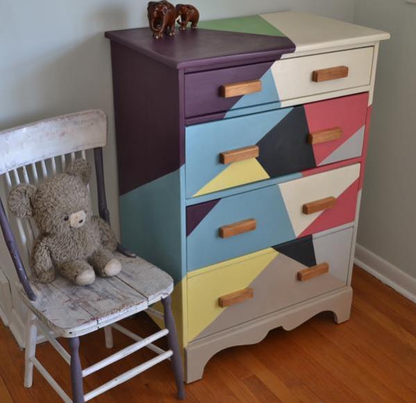
The paint is all Annie Sloan Chalk paint but most of the colours have been mixed to create the tones that you see.  Only the Old White and the Graphite are unmixed.  One of the wonders of chalk paint is how easy it is to create new colours.

zig zag 7

The wooden handles are original to the dresser.  I stripped them and left them in their natural state.  I think this dresser will look lovely in a child’s room.
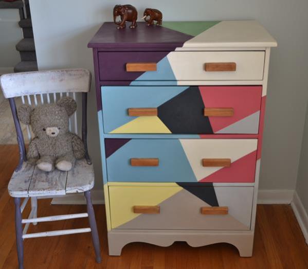
zig zag bureau

zig zag 5


zig zag4

Linking up with:

<br />

McCall Manor

<p>


http://linda-coastalcharm.blogspot.ca/2016/04/show-and-share-no-309.html

http://www.elizabethandcovintage.com/

http://www.mccallmanor.com/

The Creative Circle week 61

http://piecedpastimes.blogspot.ca/

http://www.bluewillowhouse.com/2016/04/14/vintage-charm-26/

http://www.sadieseasongoods.com/talk-town-link-party-15/

Making Broken Beautiful | No. 34


http://www.findingsilverpennies.com/2016/04/silver-pennies-sundays-link-party-164.html


Stepback Cupboard

Stepback cupboards have a top section which is set back from the bottom.  They are a popular design which dates back centuries.  The cupboard that I painted was primitive in design and handmade.  The stain which was opaque was dried out and peeling away in most places.  This is what it looked like on Etsy where I purchased it from a local business called  In the Raw Vintage.

stepback cupboard#1

I had to do a lot of sanding to get rid of that peeling stain.


stepback cupboard1

I painted the cupboard in Annie Sloan Country Grey and added Old White dry brushing to give it texture.  The inside was painted in a Provence mix.

stepback cupboard 2

This is a closer view of the dry brushing.  Country Grey is a perfect colour for a rustic piece like this.  It is a neutral “greige”and the type of colour you see on old furniture.  I don’t think the handles and knobs were original but they are old brass.  I painted them with  both colours and added copper gilding.  Now they look like verdigris.

stepback7

stepback 3

stepback 4stepback 5

stepback 6

The painted version is definitely an upgrade over the original which was not usable in its peeling state.

Linking up with:

http://www.patinaparadise.com/2016/03/fridays-furniture-fix-31.html

http://piecedpastimes.blogspot.ca/

Home

http://linda-coastalcharm.blogspot.ca/2016/03/show-and-share-no306.html

http://www.sadieseasongoods.com/

http://thecuratorscollection.com

http://www.mccallmanor.com/

The Creative Circle Link Party

Arts and Crafts Style Desk

The Arts and Crafts movement took place between the 1880’s and 1920’s.  It emphasized traditional artisan techniques and craftsmanship and was a reaction to mass produced furnishings.  William Morris, who is seen as the father of this movement in England, believed that things should be functional as well as beautiful, and made from local materials.  Gustav Stickley is associated with the movement in the US and his influence can still be seen in furniture and the popular craftsman style bungalows that are all over North America.

oak desk 1

This oak desk is in the Arts and Crafts style; it is also known as a library table or a Stickley desk.  It is solid oak, is very plain except for the small backboard and has shelves on the side.  Most of the Stickley desks have arched slats in the front rather than the solid piece that this one has.  I don’t think this desk is an antique but it is old and very well made.  I stripped the top and used an oxidizing mixture on it because I wanted a weathered, rustic look.  You can read about how to oxidize wood here. It turned out to be a good decision because after many sandings, I could not remove all the scratches and discolorations.oak desk 3

oak desk 5

Oxidizing reacts with the tannins in the wood and turns them black or grey like you see on wood that has been exposed to the elements.  I painted the base in Annie Sloan’s Emperor’s Silk which is a bright red that goes well with the rustic look. I applied dark wax as well because it adds depth and texture.  I am not a dark wax fan except for this type of look and on dark colours.

oak desk 4

oak desk 2

The knobs are old wood ones that I had lying around.  I also painted the inside of the drawers after spending 2 hours removing the adhesive from contact paper.  I tried Goo Gone but it didn’t work and eventually I used cooking oil, a scraper and dish soap to remove the oil.

oak desk 6


Linking up with:

http://www.patinaparadise.com/2016/03/fridays-furniture-fix-29.html

Making Broken Beautiful | No. 28

http://piecedpastimes.blogspot.ca/

Home

http://www.recreateddesigns.com/2016/03/bewitchin-projects-block-party-25/

http://www.elizabethandcovintage.com/

http://www.sadieseasongoods.com

http://thriftyrebelvintage.com/2016/03/vintage-charm-21.html/

http://www.mccallmanor.com/


Figured Maple

When I bought this vintage desk, the owner told me it was maple and I had no reason to disbelieve him as it is very heavy and it was covered with a thick red/brown stain. This was a popular stain in the 1940’s-50’s for maple furniture but it is not the honey-brown that we usually see on such pieces  I forgot the before photo of the desk so it looked something like this dresser:DSC_0049

It was impossible to see the grain of the wood underneath the opaque stain which was almost like paint.  After stripping it, I was delighted to discover figured maple.  Figured maple also known as flamed, curly, ripple and bird’s eye is a feature of maple in which the wood fibres are distorted in an undulating chatoyant pattern.  It is quite distinctive and doesn’t look like ordinary maple.

long desk5


You can see in the photo that the grain is very pronounced and resembles something like oak.  I went for a darker colour stain and mixed Dark Walnut with Jacobean.  On a wood like walnut or mahogany this would have come out much darker but maple is difficult to stain and I highly recommend wood conditioner that acts as a sealer and helps the wood to absorb the stain evenly.  I prefer standard oil-based stains because they allow you to see the full beauty of the wood.  If you are going to spend hours stripping and sanding, it seems a shame to cover it up with gel stain.

long desk6

I painted the base in a 50/50 mix of Country Grey and Greek Blue.  I love watery blues and this is a blue/green/grey hue.

long desk3

I had thought of staining the knobs like the top but instead I painted them and added gilding  to make them a bit more feminine.  I am quite happy with the result.long desk1long desk2

long desk4

Linking up with:

http://www.elizabethandcovintage.com/

http://www.holy-craft.com/

http://www.mccallmanor.com/

http://www.bluewillowhouse.com/

Making Broken Beautiful | No. 26

The Creative Circle Link Party

http://www.patinaparadise.com/2016/02/fridays-furniture-fix-27.html
http://piecedpastimes.blogspot.ca/2016/02/saturday-sparks-link-party-155.html/

Home

http://www.thepainteddrawer.com/2016/02/the-link-party-lets-keep-trying.html

http://www.recreateddesigns.com/2016/02/bewitchin-projects-block-party-24/


A Playful Dresser

This antique dresser was probably just wood at one time but over the years it had been painted a few different shades.  When I bought it, it was a pale peachy beige and the inside of the drawers had been wallpapered in a beige and peach floral.  I have removed wallpaper from walls before but I had forgotten how much work it can be.  I might have reconsidered buying the dresser if I had known how much time I would need to remove it.  I thought about just painting over it but the wallpaper wasn’t in great shape and the corners weren’t very well done.  Because the dresser is on the small side, I just couldn’t see an adult using it so I painted it with a child in mind.

kid's 6


It gave me a chance to use FrogTape Shape Tape which gives a nice clean edge and a playful look.  I  admire the work of Poppyseed Creative Living who uses this tape a lot in her designs.  She has been an Annie Sloan Painter in Residence and has many great pieces.

kid's3

The white looks pure white but it is actually a 50/50 mix of AS Pure White and Old White.  You can see that I got the wallpaper out of the drawers and painted them, as well as placing a bright orange wrapping paper inside.  The turquoise is AS Provence which is a lovely saturated blue/turquoise.

kid's 7


The antique-looking porcelain knobs are from Lee Valley and are a nice touch without being too feminine.

kid's 5

kid's 2


Linking up with:

http://www.elizabethandcovintage.com/

http://linda-coastalcharm.blogspot.ca/2016/01/show-and-share-no297.html

Making Broken Beautiful | No. 22

http://www.mccallmanor.com/

http://www.patinaparadise.com/2016/01/fridays-furniture-fix-23.html

http://www.thepainteddrawer.com/2016/01/fab-friday-link-party-2.html

Best DIY Projects and Recipe Party

http://piecedpastimes.blogspot.ca/

Home

Welcome to The DIY Dreamer!

http://www.sadieseasongoods.com/


Pieced Pastimes


Elizabeth and Co.