Just for Kids

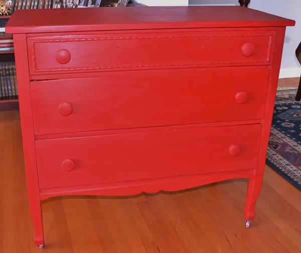
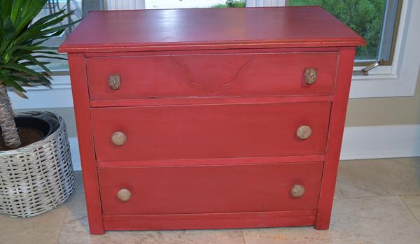
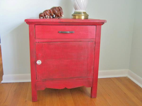
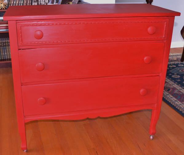
I recently painted a dresser for a 2-year old named Henry who was changing rooms because of his new little brother, Alfie.  Aren’t those cute names?  Henry’s parents had me paint this dresser for his nursery 2 years ago.  It’s an old farmhouse style  that they wanted in red:

DSC_0002(15)

DSC_0003(7)

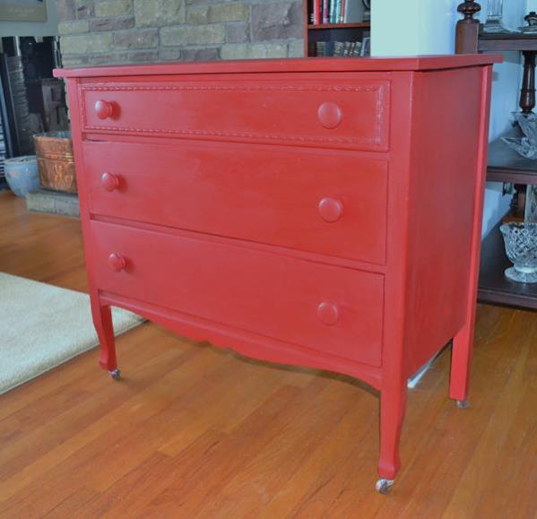
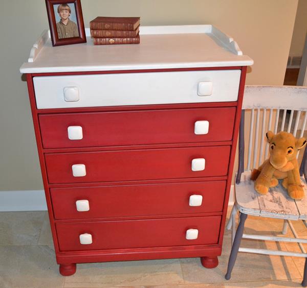
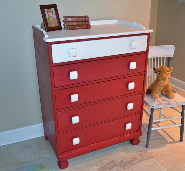
They are keeping it which doubles as a change table for baby Alfie and bought a small tallboy for Henry.

meg's dresser

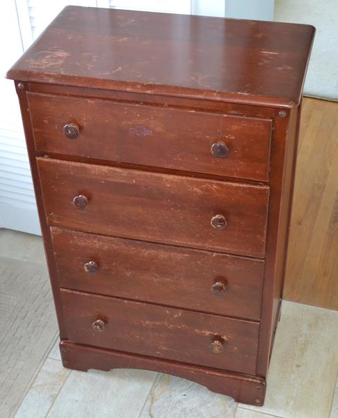
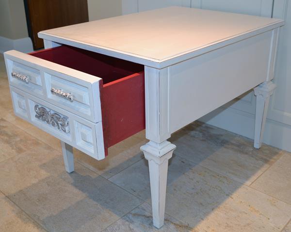
It’s maple and very heavy with solid wood drawers that weigh a ton.  I covered the whole thing with a coat of shellac because I have learned that that reddish stain used before poly finishes bleeds through paint, even latex.  Henry’s mum wanted 3 colours: navy, yellow and cream.  I was influenced by the wonderful furniture painted at Poppyseed Creative Living ( she is very talented) and created a colour-block effect.

henry's dresser2

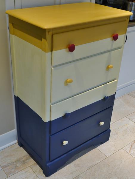
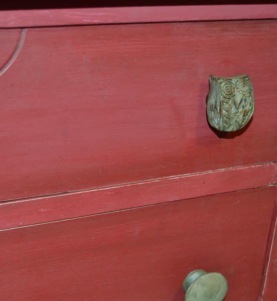
The colours are Annie Sloan’s Arles, Cream and Napoleonic Blue.  I copied the colour-block on a few of the knobs and added the larger red knobs painted in Burgundy for an extra punch.  The hardest part was getting the lines straight.  I started with the drawers in the dresser and taped through the middle of the drawer where the holes are.  Then I lined up the lines on the side.  This required a measuring tape and marking with a pencil.  I do not have a straight eye, so I will tape on a slant without markings. When using light and dark colours, I would recommend painting the light one first then the dark overtop.  With this design there is a fair amount of overlapping.

henry's dresser1

henry's dresser 3

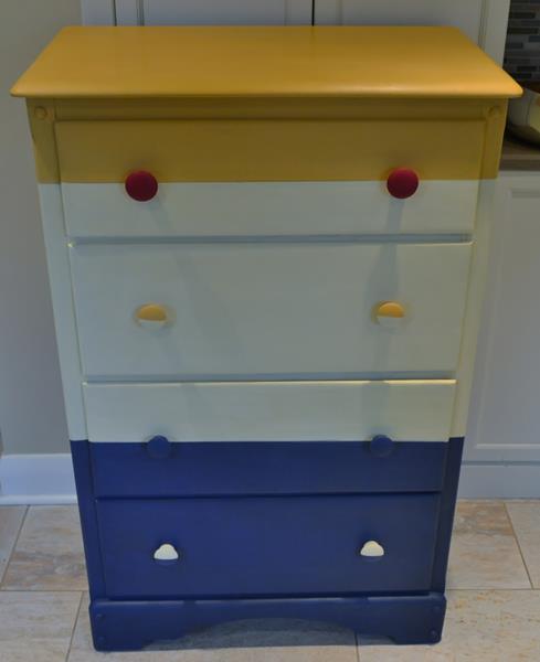
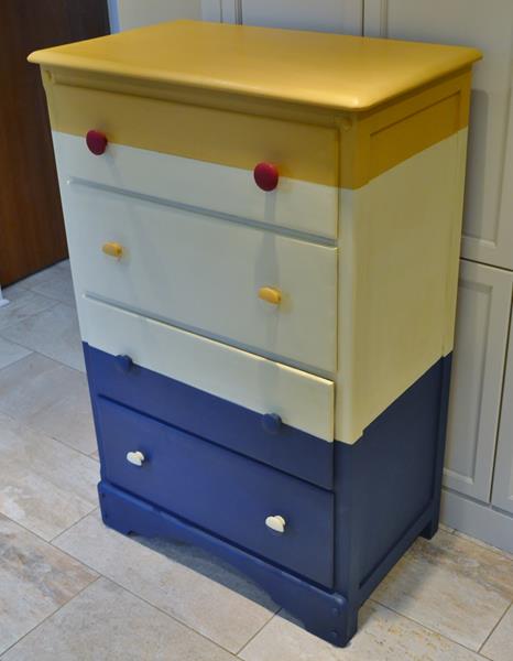
In retrospect, I might have mixed the Arles with English Yellow to get less gold but I am happy with the result.  It has a wax finish which I like the look of better than poly and which is durable after it is cured, especially on something like a dresser.  I tend to use poly on table or desk surfaces but have found that wax  has worn well on all the pieces that are in my house.


Linking up with:

http://www.patinaparadise.com/2015/12/fridays-furniture-fix-20.html

Making Broken Beautiful | No. 18

http://www.mccallmanor.com/link-party/your-inspired-design-16/

http://piecedpastimes.blogspot.ca/

http://www.sadieseasongoods.com/snickerdoodle-sunday-link-party-112-end-of-year-announcement/

http://www.findingsilverpennies.com/2015/12/silver-pennies-sundays-link-party-and-features-149.html/

http://linda-coastalcharm.blogspot.ca/2015/12/show-and-share-no-293.html

http://www.elizabethandcovintage.com/


Red and White for Canada Day

July 1 is Canada Day and usually it is warm weather but here in Ottawa and the eastern part of the country it is wet and cool.  It doesn’t bode well for the summer.  I thought  I’d cheer myself up with some of the reds and whites ( Canada’s flag) that I have painted.  This antique dresser was a custom job for a baby’s room and was painted in Emperor’s Silk.

Antique dresser painted with Emperor's Silk

DSC_0002(15)

I painted this vintage maple dresser in a red and white mix.  The red is actually Emperor’s Silk with MMS Tricycle on top to deepen the colour.

DSC_0004(7)DSC_0003(5)

This antique dresser is MMS Tricycle with dark wax.  The same goes for the old ironing board.

DSC_0001(23)

DSC_0004(23)

DSC_0001(24)

This little school desk was one of the first things that I painted.  It is also MMS Tricycle

IMG_0546

And another MMS project with dark wax.

Red Washstand

Red Washstand

A pure white table with red drawers

DSC_0003(12)

And finally, a Burgundy coffee table with a Graphite wash

DSC_0002(34)

Have a great July.

Best DIY Projects and Recipe Party

http://www.findingsilverpennies.com/2015/07/silver-pennies-sundays-link-party-and-features-127.html

http://www.lifeonlakeshoredrive.com/

http://www.thededicatedhouse.com/2015/07/make-it-pretty-monday-week-142.html#more

http://linda-coastalcharm.blogspot.ca/2015/07/show-and-share-no269.html

http://www.elizabethandcovintage.com/

http://missmustardseed.com/2015/07/furniture-feature-friday-favorites-link-party-72/

http://www.thepainteddrawer.com/2015/07/the-painted-drawer-link-party-7.html

Decor Trends and the Upcycling Business

It’s a fact of life-the moment that something becomes popular in the DIY world or in regular stores, it is already considered passé in the fashion world. Home decor experts are always predicting new trends and telling us what is now out or overdone. Fortunately, for those of us who paint furniture, the average consumer is about 2 years behind the trend and lots of colour is still hot for 2015. When all-wood furniture and neutral colours become popular again, I know I will be out of business.
This recent article from the Wall St Journal,” Top 5 Interior Design Trends ..” states that the following are overused and therefore, out: Chevron Prints, Text as Decor, Mirrored Furniture, The Ombre look and Beni Ourain Rugs.  It’s too bad because there are a lot of people who are just warming up to those looks.  I don’t own any mirrored furniture but I could love a piece in a bedroom and the dipped-look on chair legs or tables is actually a revelation to some people.  I have no idea what a Beni Ourain rug is so I guess I missed that one.  You do see chevron and French script everywhere, most particularly in fabrics.  A quick search on the internet will show you that in the painting world, these 2 design elements have been popular for about 5 years.  So, if you really want to be cutting edge you have to stay ahead of the curve and not copy it.  When we renovated our kitchen awhile back, we chose a glass and stone back splash because we loved the colour and look.  Since then, I’ve seen it everywhere which means that it will look dated sooner because it is so popular.

What’s in:  Mixed metals, moody indigo, painterly rugs, smoky glass and graphic tiles.  From the furniture painter’s viewpoint, the moody indigo may signal a trend towards navy blue which is a colour that I have not seen much.  I’d be quite happy to switch from white, greys and black for awhile.  Graphic tiles reflect the continuing interest in all graphic designs so that trend may continue on in furniture such as on drawer fronts.  It does seem to suit Mid-Century designs the most.  I can’t see the painterly rugs having much effect but as an aside, for once I am ahead of the trend as we just purchased a new dining room rug which looks like art.  I am hoping it won’t be too much of a trend because I like the uniqueness of the look.  You can see a bit of it in this photo:DSC_0003(31)

This Mid-Century night stand is now painted in a colour that I would call peony-pink.  It is a cross between Pantone’s Radiant Orchid from 2014 and Pantone’s 2015 colour which is Marsala.  Actually it is painted in Annie Sloan’s Burgundy mixed with a bit of Pure White.  You’ll notice that it has brass feet which give it a dipped look.

DSC_0002(41)

I’ve actually painted this table before but repainted it because it never sold.  In its previous incarnation, it was painted in Old Ochre with a lightened Provence interior.  I chose those colours because they really remind of the pale colours that were popular in bedroom furniture from the 50’s.  Maybe this deeper hue will have more appeal.

DSC_0005(26)

Where I live in Canada, many of the design trends that are seen in the DIY world have not caught on at all.  Some people like the shabby chic look, if it is white; very few go for the chippy, old appearance.  People who buy painted furniture seem to prefer that it looks newer or more solidly painted.  The combination of wood and paint is still popular as is red or grey for babies’ rooms.

And since I have been discussing decor trends: I think that mason jars, burlap and antlers have seen their day and people will be looking for the next new idea.

http://www.lifeonlakeshoredrive.com/2015/01/time-to-party-at-bouquet-of-talent-with.htmlhttp://www.findingsilverpennies.com/2015/02/silver-pennies-sundays-link-party-features-105.html
http://elizabethandco.blogspot.ca
http://missmustardseed.com/
http://www.gingerlymade.com/2015/02/show-saturday-link-party-18.html

Annie Sloan’s Burgundy

Burgundy chalk paint has recently been introduced to the Annie Sloan North American market and I was really happy to try it.  It belongs to the blue-red family which I like much better than either the orange or brown reds.  Annie Sloan describes it as the colour of dark cherries and it does look beautiful with traditional furnishings.

I used it on a vintage mahogany coffee table that had great ball and claw feet and nice carvings.  I put on a coat of Burgundy but found that when it dried it was much darker and more maroon than when it was wet.  This is one of those colours that really looks different when it is dry.  I wanted more of a cranberry colour so I mixed 5 parts Burgundy with 1 part Old White and got exactly what I was after.  Burgundy has a lot of pink tones in it so when it is lightened, it will make various shades of red and pink.  The lighter colour is my mixture unwaxed


DSC_0006(19)

beside the unwaxed burgundy.  I used Graphite on the details to make them stand out and I made a dark wax glaze by mixing it with Varsol.  I put the glaze all over the table and it intensified the colour nicely.  Waxed, the table turned out a rich, glowing cranberry.

DSC_0002(34)DSC_0005(19)DSC_0003(24)DSC_0006(20)

I think Burgundy is a colour that will look lovely beside blues or set-off  by white.

http://www.redouxinteriors.com/2014/10/redouxinteriors-handmade-hangout-week-17/
http://missmustardseed.com/2014/10/furniture-feature-friday-favorites-link-party-42/

http://chiconashoestringdecorating.blogspot./
http://www.lifeonlakeshoredrive.com/2014/10/bouquet-of-talent-linky-party-and-top.html
http://www.findingsilverpennies.com/2014/10/silver-pennies-sundays-link-party-features-91.html
http://threemangoseeds.blogspot.ca/

That DIY Party


http://www.thededicatedhouse.com/
http://elizabethandco.blogspot.ca/
http://thediydreamer.com/from-dream-to-reality/share-beautiful-creations-140/
http://www.greenwillowpond.com/2014/10/what-we-accomplished-wednesday-64.html
http://sweethaute.blogspot.ca/