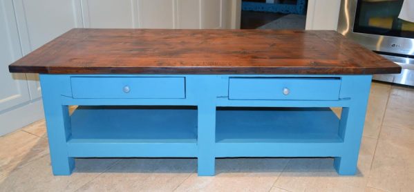
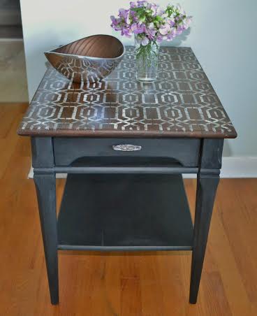
Annie Sloan recently introduce Giverny to her North American market. It is a bright clear blue named after Monet’s village in France. I had hoped that it was a bright turquoise-blue because photos of it make it look that way, but it’s not. You can see it here. I mixed it in a 1:1 ratio with Florence and a bit of white and got the colour that I wanted for this coffee table. I bought this second-hand for my daughter; it is from some place like Indonesia and is heavy wood. It had a thick brown stain on it but you could see the marks and knot holes through the stain.
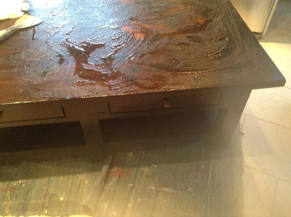
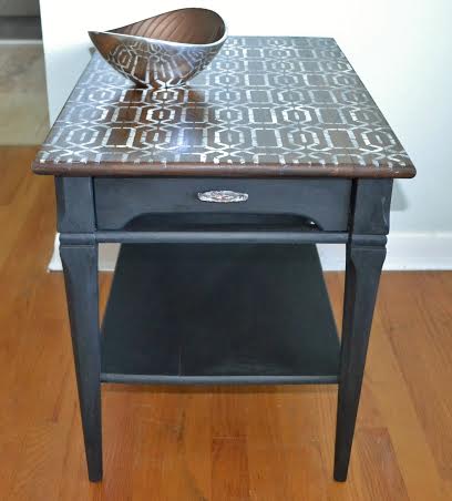
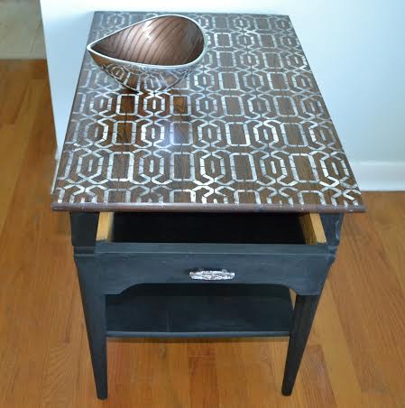
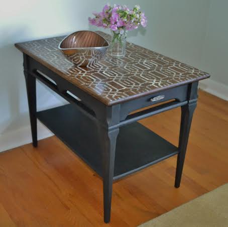
I stripped the top and found very rough wood. Rather than cover it , I decided to keep the rough look because it is definitely reclaimed looking. I applied 2 stains, walnut and grey, and 3 coats of wipe-on poly.

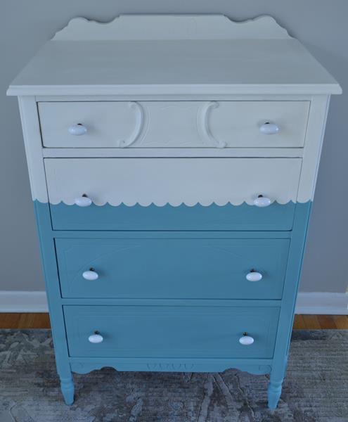
The base was painted in the chalk paint mix. Deep chalk paint colours give great coverage and I didn’t have to use much paint. I wanted a clean modern look suitable for this style.
I love Annie Sloan’s stencil called Trees. I stenciled some craft paper with it and lined the drawers.

I stenciled one way then in different directions over top. It has a modern primitive look that matches the table.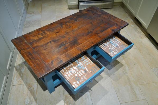
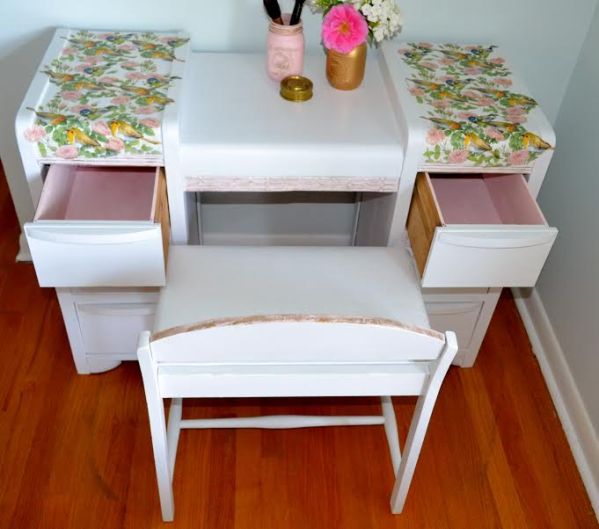
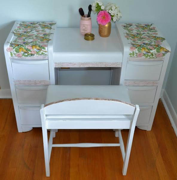
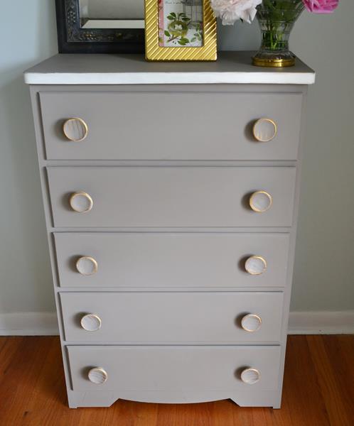
This is going in a contemporary living room with a leather couch and a pale grey rug that has bits of colour in it, one of which is turquoise.
http://www.findingsilverpennies.com/2016/09/silver-pennies-sundays-link-party-185.html
http://piecedpastimes.blogspot.ca/


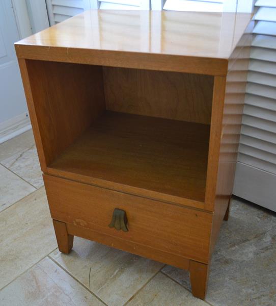
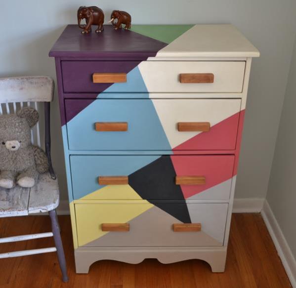
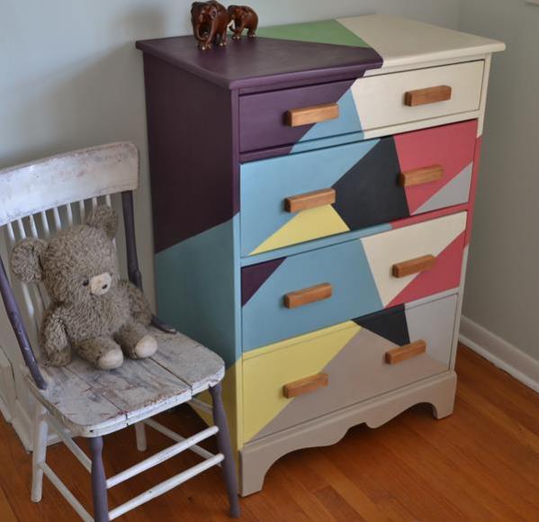
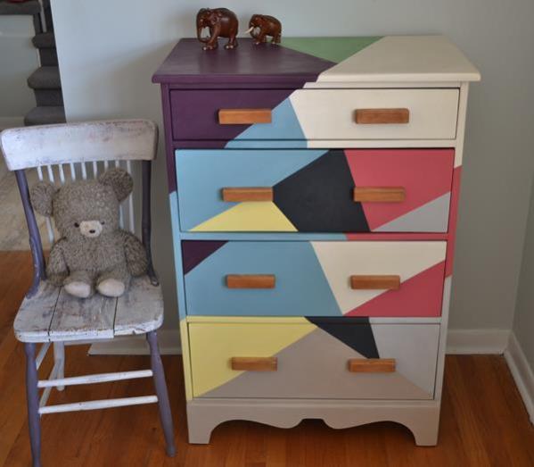
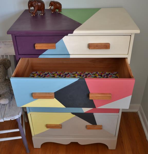
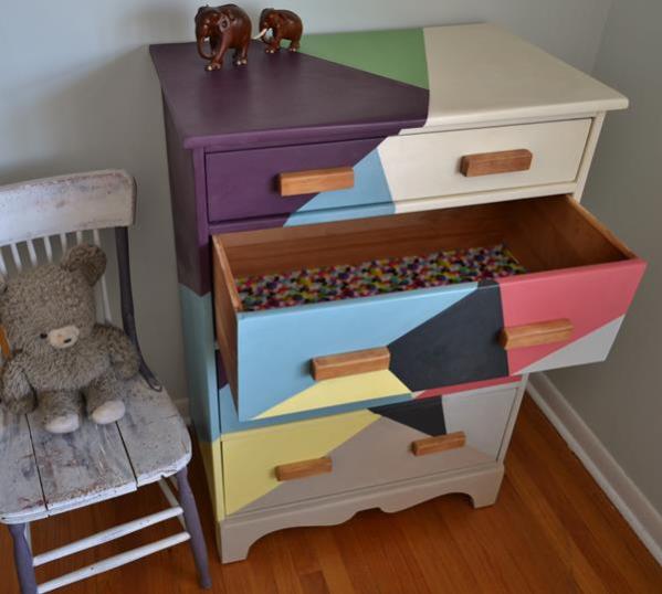
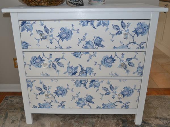
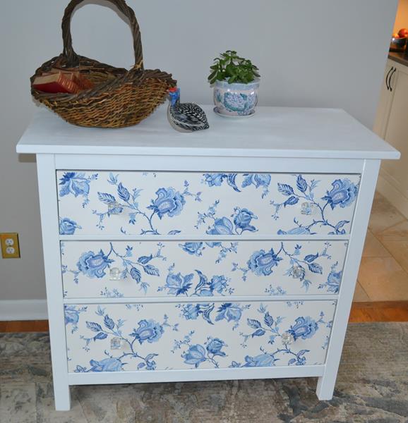
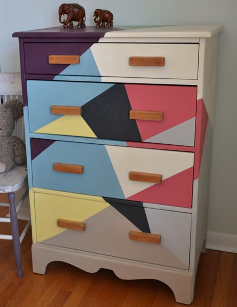 I bought this vintage maple dresser knowing that I wanted to try something like this zig-zag pattern on it. The dresser is probably about 50 years old, solid maple, even the drawers, and not very big. Its size makes it perfect for a child’s room. I have seen dressers painted like this online and wanted to give it a try.